Thursday, December 30, 2010

Feature-Complete & Bug-Replete

For those wondering when the Beta version is going to be released, I'm happy to announce it is, of today, feature complete. It's also filled to the gills with bugs, so I'm not releasing it just yet.


In way of showing off some of the new features in the beta, here's a high-level snapshot of my Gigantt work-plan.


Keen observes can see that there are three types of views, and the one activated in the image above is the "resource view". It shows how the plan looks when projected onto the calendar.


Another nice feature is the green progress bar that indicates how much of a complex task is already completed. Here's a zoomed in version:


about 80% done

This gives you a quick visual indication of how far along your project is and you can zoom in to see which tasks are yet to be done.


Here's how the new search window looks:


You can filter out done items and see a clear separation between an item and its location in the plan.


I also implemented auto-save today, which means you don't have to obsessively click Ctrl+S every minute. So that's nice.


Bottom line, it looks like I've got about two weeks of debugging before I can release this version. It shall be called "beta 1" and it's still invitation-only. There are probably going to be one or two more beta versions after it before the public version is launched.

Sunday, December 19, 2010

A Sneak Preview of Beta Features

Working hard on the first beta version. Still about at least two weeks to go, but I thought I'd share a sneak preview of some of the things I'm working on in the form of a screenshot:


Basically two major new things are happening here:

  1. Smart routing of edges (arrows) makes the whole thing easier to grok.
  2. The duration of each task is indicated by its width.
The above screenshot is taken from my own work plan in Gigantt, which has now reached more than 1100 "work items", and is still as easy to use as it was when it was much smaller.

Some other stuff I've already completed:
  1. Awesome animated transitions when editing. You'll just have to wait and see.
  2. Drag & Drop.
  3. Advanced search.
  4. Smarter zooming (that works well even with no mouse wheel).

Thursday, December 9, 2010

Alpha V2 - The Mouse Strikes Back

I'm happy to announce v2 of the Alpha is live. If you're already registered you can see what's new in the tutorialHere are the highlights.


Connections between remote items


Often your plan needs to show that a task from project A is blocking an otherwise unrelated project B. Instead of stretching long and winding lines between them, Gigantt visualizes such connections with mini-arrows that let you jump back and forth.


Collapsing sub-graphs

When a part of the plan gets out of hand and becomes too complex you can collapse a selection of items into a single new item. This simplifies the appearance of the plan.

Crude time estimate

If all you're interested in is counting how many days are left for each part of the plan, then you got it. Gigantt lets you estimate each task and sums up complex items for you. 
  • If you estimate an item and then add sub-items inside it, the initial (parent's) estimate is ignored. This nudges you to spend a few more seconds thinking about the actual sub-items instead of giving a rough buffered estimate to it all.
  • Estimates are intentionally discrete and range from 15 minutes to 1 week. Higher resolution is unimportant for effort estimates. It's more important to be able to flush out the different parts of the plan quickly than to be able to estimate any particular part at 18 rather than 19 minutes. 
  • More complex time estimates (and deadlines, start/finish-times, etc.) will come in later versions.


Planning backwards


This may be my favorite feature of this whole application. Sometimes it's easier to think of an end goal and then work your way back. Gigantt now lets you do this by making it just as easy to create a "predecessor" item (Ctrl+Enter) as it is to create a "successor" item (Insert).


The mouse strikes back


Lots more shiny new buttons and other features that you're going to have to discover for yourself. In particular, the last release was all about the keyboard. This release focuses on the mouse and lets you achieve with it anything you could do with a keyboard shortcut. The keyboard is still the fastest way to edit a plan (can use more fingers..), but sometimes you just need to get by with the mouse, and now you can.


p.s.
If you're not seeing the new UI when you log in, then try to clear the browser cache. I might have used the wrong caching configuration in the previous release. Please let me know if this happens to you.

Saturday, December 4, 2010

Tracking Gantts Considered Evil

No single invention deserves more credit for making project planning as unpopular as it is today than Tracking Gantts. Tracking Gantts should not only be considered harmful - they should be considered evil. Here's why.


Reason #1: Their motivation


Tracking Gantts let you see, for each step of your plan, how long you thought it's going to take and how long it's actually taking. You get to know, every day and in status meeting, that phase X was supposed to start by March, but it's clearly not going to get started until May.
Awesome.
You already knew, when you did initial planning, that the plan is going to have to change as the project progresses. New information comes to light. People and resources are unpredictable, etc. So why is it important to constantly be reminded, in every status meeting, how poorly your early predictions are fairing in real life? 


Reason #2: They force you to stick to the original plan


The very idea of tracking a project's Gantt chart means that instead of focusing on constantly adapting your work plan based on new information, you choose to stick to an outdated plan, just because it lets you point fingers and highlight the mis-predictions that were the inevitable result of the huge amount of uncertainty that the early planning phase of the project entailed. After all, you can't track the Gantt if you allow the plan to change radically, right? It has to have the same general shape and be comprised of the same steps, otherwise there's nothing to track...
Boneheaded sticking to plans is the number-one reason why "Waterfall" is actually considered a pejorative term these days. Planning ahead is confused with sticking to the original plan. 


Reason #3: They teach you nothing


It's not like the delay in this project is actually going to change the way you plan the next project, unless the projects you're planning are predictably similar and repetitive. After all, that's what Gantts were initially used for - planning work in factory production lines, where tasks are very well defined and their duration is extremely predictable. 

The value that tracking adds to a software development Gantt chart is zero. Arguably even less than zero. Not only are past estimations irrelevant for new projects, the illusion that you can actually improve your estimation ability over time by retrospection is dangerous. Sure, a CS student might really not know that integration takes lots of time in real life. But anyone that's been involved in more than two projects in their lifetime is already well aware of the usual suspects for delayed projects. The real reason projects are delayed is not some mathematical error factor that must be applied to estimations in general - it is the inherent uncertainty that comes with doing something for the first time and not knowing exactly how it's going to pan out.

There are actually project management systems out there that try to attack the problem from this misguided angle. They measure your predictions vs. actual performance and try to correct your overall estimation using statistical analysis. As if "Danny always underestimates everything by 14.3%" is ever the case. Danny isn't stupid, and to assume that the error of his predictions is predictable is indeed idiotic. It confuses the primitive "cure" - adding factors to your estimation - with the cause of the problem. Your estimation isn't inaccurate because it wasn't multiplied by the "correct" factor. Your plan is simply incomplete; and every plan is incomplete in its own way.

Reason #4: They focus your attention on the wrong things

Instead of being focused on what needs to get done to deliver on time, you're now focused on justifying your inaccurate predictions. Instead of focusing on planning in more detail and adapting your plan to new information, you're rehashing an outdated plan. Projects are seldom delayed because the work-plan's parts were incorrectly estimated. They're delayed because a crap-load of things were simply left out of the original plan. Tracking Gantts make this even worse, because what sort of motivation do you have to insert more detail into your plan if it's all just going to wind up highlighted as a poor estimations in every status meeting? They make you stick to large, track-able chunks of work in your Gantt chart. Instead of letting you focus on adaptation and getting on the right track, they make you reexamine irrelevant decisions that were made when less information was available.

There's also the problem of not having good enough tools to manage sufficiently elaborate plans. You have a much better chance at constructing a good initial plan (and estimation) if your tools allow you to expose all those frequently neglected steps along the way. Traditional Gantts are low-resolution beasts that are rightfully seen by developers as caricatures of the reality of project management. What's needed is a tool that makes it easy to add as much information as possible to the work plan at the earliest stage, and then make it just as easy to adapt your plan as the fog of uncertainty slowly fades away from over your project. The last thing you need is incessant low-resolution reminders of your inaccurate past predictions. Tracking Gantts are good for pointing fingers and covering asses, not for getting things done.


Tuesday, November 30, 2010

Goodbye, Amazon

Tonight I moved my servers out of Amazon's cloud and into Linode's. Life on Amazon's cloud has not been simple these past few weeks.


But, wait, you ask - isn't Amazon the first and most prominent cloud provider? And I've never heard of Linode...


That's what I thought for a while. It's what I thought when I first started noticing problems connecting to Amazon's instances - hey, it's probably my fault. So I set up multiple "ping" services to check my web site every 10 minutes to see if it's available. I used Pingdom.com and WasItUp.com. And guess what I found out - it's not me, it's them. Their instances are simply flaky. And incredibly weak.


Let me explain exactly how bad it is. For 2-3 weeks I had the following configuration: 2 load-balanced Amazon instances that serve simple static HTTP pages with Apache. Now, nobody was using them, just to be clear. They were simply there for the purpose of being pinged every 10 minutes.


The result was multiple periods of unavailability lasting a few minutes each every day. My iPhone's SMS inbox was getting full from all the downtime alerts I was getting. This, you might say, is completely unacceptable already, so why the hell did you launch your Alpha on this platform?
Well, I shouldn't have. I should have trusted my own tests. 


But the straw that really broke the camel's back was on launch today (two days ago). The system came up and lots of people got invitations to log in. After about 30 minutes the connection to Amazon became a 3KBps upload silly-straw. This meant that even relatively simple operations like saving a Gigantt plan with a few hundred work items took 20 seconds, and sometimes it timed out. The servers themselves weren't stressed at all - it was Amazon's network, which is also very flaky. This is even after I moved my servers from east-cost U.S. to their Ireland farm, mind you (I initially suspected that the east-cost might be a bit too far and that the EU farm may improve latency for me).


Now that I moved to Linode life seems so much better. I got my own HAProxy, and I don't have to rely on Amazon's weird ELB product for load-balancing. The instances are much much stronger (albeit more costly) - buy, hey, you get what you pay for. And the bandwidth is terrific. Let's just hope it stays like this.


In the process of choosing a cloud provider I tried all the big players: Amazon, GoGrid, Slicehost, Linode and Rackspace (well, I couldn't even finish the signup process on Rackspace, to be honest, it was just so painful, so let's take them out of the list).
I knew Amazon had problems, and yet their reputation made me suspect the situation will be similar on other providers. Even after I tested and compared their availability I hesitated to switch away from Amazon because, well, it worked, most of the time, and I had more urgent things to accomplish. That all changed once my servers stopped working 30 minutes into the launch. I hope I learned my lesson.


I also want to commend Linode's support team. I opened a support ticket within the first hour of signing up and they responded in 5 minutes, and followed up for the next 2 hours to help me sort things out. Excellent customer service. Amazon, btw, has no customer service to speak of (unless you're willing to cough up exorbitant fees).


Bottom line, I hope the transition is smooth and that nobody's experienced any down time at all. If you notice anything fishy please let me know. I'm keeping the Amazon instances on for now, just for backup, until I see everything is nominal.


Thanks, Dima, for telling me about Linode.

Sunday, November 28, 2010

Gigantt Alpha is Here

The Gigantt Alpha is here

It is by invitation only, and those that have requested an invitation will receive an email today with instruction on how to log in.
I highly recommend going through the What's New section of the tutorial (login required) to see what has changed. 

What does Alpha actually mean?

It means that it's a work in progress, and there may be bugs and prolonged periods of unavailability. I'll do my best to minimize them. But it's not that bad: Gigantt's servers are virtualized over Amazon's Cloud and use highly reliable storage. They're also backed up entirely every hour, so you can rest easy that data-loss is unlikely. In addition, all communication is encrypted and no passwords are stored (only hashes).

What's Missing
  • Still no time estimates and resource allocation. Coming soon.
  • Still no auto-save, so do Ctrl+S from time to time.
  • Still no collaboration, so only one person can edit a plan, and if you save from multiple browsers simultaneously you may overwrite your changes, so watch out.
  • Still no easy way to connect remote items. But this, too, will be added very soon.
Other than that, it's a dream for personal management. If you don't agree, there's a feedback button inside - use it.

What's next? 

I plan to release a minor version in a week or so that will address any issues found by alpha users. This release shall also include a crude implementation of time estimates and creating remote connections (i.e. between items not in the same container), just to make it a bit more usable for small teams.

Friday, November 12, 2010

Who wants Kibble?

Gigantt is officially eating its own dog food. After 6 weeks of work I'm very proud to announce that I am now using Gigantt to plan and manage itself. Setting this canine-cuisine goal for myself so early in the project, I now realize, was the smartest decision I've ever made. Right away, I could tell what's crucial and what's not. What's really annoying - to the point of hurting usability - and what's just aesthetic nitpicking on my part. It also made me realize that I've still got a long way to go until I can release this product into the wild.


As you no doubt remember, I'm working on the private alpha version now, and by dog-fooding I'm finding out I still have quite a bit of work to do. More than I'd planned initially. There's a wide gap between cool and useful, and there are lots of tiny features to implement without which the system is just too annoying to use. 


Thanks, by the way, for signing up for the alpha. Lots of people signed up - more than I expected. While there's no link to a cool showcase in this post, I can at least tell you a bit about what to expect in the alpha.


Planned Alpha Features

  • Saving plans. Obviously, this requires quite a bit of work in terms of creating a server-side, setting up user accounts, security, etc. 
    • Sign-up is by invitation only at this point.
  • Improved editing
    • Cut & paste using a multiple-item clipboard.
    • Undo (simple, right? I wish...)
    • Reordering items by drag-n-drop.
    • Deleting connections between items.
  • Being able to mark items as "done".
  • A feedback box, for quick one-click "listen, this product sux big time and you should quit" messages from early adopters.
  • Lots and lots of tiny improvements that you'd hopefully not even notice because they're so natural and obvious.
Basically, the alpha will be a fancy mind-mapping system for graphs, instead of trees. As such, the alpha is useful for personal planning and management. Not quite useful for managing a team just yet. The rest of the functionality, like time estimates, resource allocation and collaboration, will have to wait for future versions. 

Wednesday, November 3, 2010

The Final Gigantt Showcase

The final Gigantt showcase - version 0.6 takes the form of a tutorial. Hopefully it's self-explanatory and anyone going through it would find the system usable in exactly two minutes.
What's New
Even though the tutorial goes through all most of the features, allow me to highlight some of the stuff I've added since the last showcase:
  • Gigantt plans are now editable. It's similar to how you might edit a mind-map. 
    • You can create new items, delete, rename and even draw connecting lines between items in the same level.
  • I've added keyboard navigation, which is (hopefully) even more convenient than the mouse.
  • You can search the map.
  • The browser address can now be used as a link to the item you're viewing, and you can also use the browser's Back/Forward buttons to navigate (update: this doesn't work on Chrome at the moment).
  • On the server side I've moved Gigantt to Amazon's AWS Cloud Service. Hopefully the scalability would come in handy (if there are ever enough users). Moving to AWS was, by the way, a very positive experience, and I recommend their service.
This is going to be the last public showcase. Thanks for following thus far, and for sending me valuable feedback. 
What's next? 
I hope to launch a private alpha in 1-2 weeks. If you want to participate in the alpha just send me an email. From that point on Gigantt will start to eat its own dog-food. Hopefully I won't be the only one using the system :). So, go ahead, give this last showcse a try and let me know what you think.


Wednesday, October 20, 2010

Zoom Smarter, Not Harder

Here's what's new in the latest Gigantt showcase.


Navigation Panel

I've added a navigation panel to the top of the page. It shows you where you are in the plan and how you got there. It also lets you jump up to "parent" items.


Details Panel
A details panel shows extra information for each item that's in focus. 
This is a bit of a break from the initial design that tried to display every related piece of information about an item inline. Inlining is cool, but after trying out a few alternatives I think this is the right direction to go. This clears up the graph area which makes it easier to visualize relationships between items.
In the future this panel will also let you specify resource allocation (i.e. who does what), show conversations people have about the item, history, attachments and more.
Also, there'n an awesome new logo for Gigantt.


Smarter Zoom

The user-interface is now truly infinitely zoomable. This means the UI works just as smoothly and as fast when you have 10,000 items in your work plan as when you have 100. This is achieved by "streaming" the relevant parts of the work plan to the UI for display, instead of displaying the whole thing as one huge scaled interface.
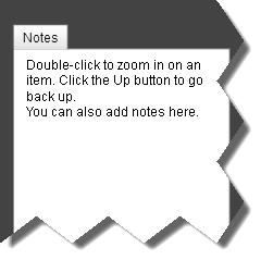
Instead of free-hand zoom this showcase tries a different approach: double-click to zoom into an item and click [Up] to go back. I think it's much more efficient and easier to navigate.

So, what are you waiting for? Go check it out.

Saturday, October 9, 2010

Robbing three casinos at once

A few weeks ago I watched the movie Ocean's Eleven a few times and spent a whole night writing down the plot's entire plan as a work-graph in Freemind. The result was a not-so-big graph (around 170 vertices), but when you try to view it all in one screen you get this:


I chose this particular plan because it illustrates a few problems with current planning tools.


Notice it's not such a big plan. 170 work-items, when each item measures in hours, is about two weeks' worth of work for a small team. Yet when you try to visualize it all in one screen you get a mess. Granted, Freemind isn't exactly designed to do this, and there are other tools that do a slightly better job at laying out graphs. But these tools don't allow you to write down and edit your plan as easily as mind-mapping tools like Freemind do.


The same plan in MS Project looks like this:


A bit less messy, but still: you can't really make out the text; the connecting lines overlap and you can't tell what depends on what; and if you zoom in you have to scroll the screen four times just to view the whole plan. And editing? Forget about it. Writing down the initial plan in Freemind took me 1-2 hours, but doing the same in MS Project was just impossible. I just couldn't do it.


And what if the plan had 1700 steps, instead of 170? Both of these tools would have failed spectacularly.


Now here's the same plan in Gigantt. Click any item to zoom into it, or use the mouse wheel. By zooming in on each level of the plan you maintain your 2D orientation and you're not lost in the details. 


What's missing? A lot. Obviously, it still doesn't show connecting lines between items. And of course it's read-only. But with time I'm going to add the ability to edit the graph as conveniently as you would a mind-map. But that's all in future showcases. Right now you can just have fun zooming around this skeleton of a Gigantt plan and hopefully be impressed by how difficult it is to rob three casinos at once.


Tuesday, October 5, 2010

Logo Design Contest is Over


The logo design contest I launched a week ago on 99 Designs has ended, and it's time to choose the winning design. I'm going for something that will convey some of the key aspects of Gigantt: zooming-in on a huge fractal graph that represents a work plan. I asked designers to create logos that capture these ideas. I mostly got logos that play on the letter G.


I got about 70 designs; about 10 good ones. Out of these, I chose the top seven that I actually see myself choosing and now I'm asking you to go ahead and vote for the winning design. The more people do, the better choice I can make.


So, what are you waiting for. Go vote.

Monday, October 4, 2010

Showcase 0.2

I think it'll be a good idea to post, from time to time, showcases of what I'm working on. At the moment I'm developing a demo, which is client-side only and read-only, to show how large graphs (work-plans) are going to look in Gigantt. I'm doing this not just for outside feedback but also for me, since the best way to design is to develop mock-ups and POCs. Keep in mind, these are tiny scraps of functionality, so please don't expect them to impress you in any way. :)


So, without further ado, here's showcase 0.2: a recursive flex control that can take any XML tree and render it by creating sub controls. So instead of scrolling and expanding the tree nodes, as you would in standard tree controls, you can just zoom in to see more and more details. The tree in the showcase is trivial - just a few nodes. Next, I'm going to work on something that can take any MS Project file and convert into the XML input format. Then I'll have more interesting trees to visualize.


Tuesday, September 28, 2010

Logo design contest for Gigantt

Help me find an awesome logo for my company by participating in the design contest. The prize is $223 and anyone can enter.


I did some mock-ups of the UI concept. I took the plot of Ocean's Eleven and created complete version of all the steps it takes to rob a casino in a "fractal" Gantt chart, which is going to be the basis of Gigantt.


(click image for bigger version)


This is a very crude and early sketch of the UI, so bare with me. But as I hope you can see, the idea is to take a very complex plan and by giving users a way to zoom-in infinitely they can drill down further and further into the details. 


For comparison, the same exact plan when plotted in MS Project looks like this:


You have to scroll 4 screens down and 2 aside in order to view the whole plan, unless you collapse and hide parts of it (and miss critical links). Just inputing it into Project took me 2 hours and editing it is nearly impossible. 


So, anyway, that's a sneak peek into what I'm working on. Many more fantastic features are planned on top of this ZUI.


Now go forward this to your designer friend who could win quite a few Shekels designing a logo that would capture all of the above.

Thursday, September 23, 2010

Planning at the speed of thought

How do you plan your projects? Some like to plan top-to-bottom; others prefer to start from the end goal and plan their way back. But no matter how you choose to go at it, one thing is common to all approaches - planning happens at the speed of thought. If your planning gear can't keep up with the speed at which you internally compose your mental plan, then it's bound to frustrate you.


That's why mind-maps are so great. Any GTD fan who has ever done a brain-dump using a tool like Freemind or MindMeister knows what it feels like to have your fingers catch up with your brain. It's liberating. Being able to serialize your thought process without skipping any detail along the way is key to successful planning. Thus, any project planning tool that introduces overhead into the process is unacceptable. And nearly all of them seem to do! There's always a form to fill, some fields to populate. You often have to switch between keyboard and mouse. These are costly interruptions to the thought process that add precious seconds to every item you jot down.


Thankfully, most mind mapping tools are built to eliminate this overhead. There seems to be a clear keyboard-based convention for creating mind map. Hit the [INSERT] button for a new child item; hit [ENTER] for a new sibling; navigate with the arrow keys. On my last project (a web mapping application) I opted to design and plan the entire thing with MindMeister. MindMeister is an amazing mind mapping tool, with a powerful collaborative twist. By the time my project entered the development phase, our work plan consisted of about 1,000 action-items - nearly all of them estimated in hours, and none longer than two days. By the time development was done, the detailed work plan of this year-long project had about 14,000 revisions and 1,700 items. That's a big mind-map. When fully expanded, this tree would require you to scroll the screen 20 times in order to see all of it. 


The fact that there were so many revisions illustrates how much of the initial plan had to change as the project progressed. That's another thing that's so great about mind maps - editing is so easy. You can turn an entire plan on its head in seconds with a few drag-n-drops. You can delete and throw away the parts that didn't make much sense. You can re-prioritize at will. 
The simple ability to visually rearrange your plan on screen quickly is crucial. Plans that are harder to change often remain unchanged and thus ignored. Ultimately, this makes people not want to plan at all. Why bother, right? If 40% of the plan is going to change after only four weeks then just plan ahead for those four weeks and plan a bit more when you get there. If only that were true. The sad truth is that there is immense value to planning ahead as far as you can think, but people hesitate to do so. The price of redoing your serialized plans is simply too high with existing planning tools. Many people miss out on the value of planning ahead because the process is painful, slow and time-consuming.


In fact, I propose that most work plans nowadays end somewhere I call the "screen horizon". Most people have no problem writing plans that fit into one screen, because that's the limit to ultimate quick editing. You can drag, drop, cut and paste very quickly as long as you don't have to scroll your screen too much. But no serious amount of planning can really fit into one screen. This is a real limitation, if you think about it. Your crappy planning tools dictate how far you allow yourself to think into the future. With a better tool you should be able to push that screen horizon forward and plan comfortably until you decide you've planned enough. With a better tool, you wouldn't mind planning further ahead, knowing very well that your plans are bound to change as your project advances. Changing plans is fine, as long as editing your long-term plan is as easy as dragging around items on a single screen. 

Tuesday, September 21, 2010

Testing, Testing, One, Two...


Hello, World!

Welcome to the Gigantt blog. No, don't bother googling it; nothing interesting will show up; yet... But let me tell you what Gigantt is going to be.

It's my plan to liberate project management from project managers. It's a web application that's going to make planning so much fun you won't be able to resist planning your projects in however great detail you desire.

Planning has become unpopular. Dare I say uncool. Everybody's "agile" these days, and it seems hardly anybody sees the value of planning ahead significantly. Waterfall is for people who work at Initech and Gantts are for Pointy-haired-bosses who grasp at any diagram that might simplify the insane complexity of the projects they manage.
Don't get me wrong. I'm not here to advocate any particular methodology. I'm just saying that if a methodology sacrifices forethought because changing plans is an annoying process, then that's a shame, because it doesn't have to be this way.

See, it's not planning that's a pain in the ass - it's your planning tools. Can you honestly tell me you're in love with your project planning solution? Didn't think so. Most of them suck, and all of them fall short of answering what I see as The Six Requirements of Planning-Software.

In my book, every planning software has to:
  1. Be collaborative (bye, MS Project!).
  2. Allow you to plan at the speed of thought. Think mind-maps. If there's a form to fill, that's a fail.
  3. Let you change plans as quickly and easily as first making them.
  4. Visualize very complex plans in a simple way. Ever created a Gantt with more than a 100 items? Exactly, it's horrible. And how will you ever visualize a plan that has 1,000 items? 10,000 items?
  5. Not try to solve every possible need of your organization. You shouldn't have to ditch email or switch to another bug-tracker because your project planning tool is an all-in-one solution that wants to take over your intranet.
  6. Realize that a plan is not a laundry list of tasks that are going to be performed. Plans change - that's the number one cause of project delays (not poor estimates). Plans are more like algorithms than checklists, and any planning tool has to be able to accomodate this fact.
In upcoming posts I plan to discuss these requirements. I hope to demonstrate why they are, in fact, necessary. More importantly, I want to tell you how this new project - Gigantt - will meet all of them.

Unfortunately, no one can be told what Gigantt is - it has to be seen.

But seriously, it's a very graphical and unique web user interface, and until you see how a 10,000 item plan can be elegantly visualized without having to scroll your screen until you get RSI, you probably won't understand what I'm talking about. For now let's say it's a project planning tool that resembles Google Maps more than it does FogBugz or BaseCamp. A web-based ZUI that's as intuitive and quick as a mind-map but also lets you represent very large, and complex graphs of work items in a clean way (mind maps are basically trees, and plans are essentially DAGs).

So, stay tuned. Subscribe and I'll update on my progress from time to time. If you have thoughts on the subject, comment away.