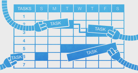
A big new feature coming at ya today: work-calendars.
Not everybody works the same days and hours. Work calendars let you define, first, your organization's standard work-week. That is, which days are working days and how many hours people work in general?
Naturally, this affects Gigantt's automatic task scheduling. With this new information the schedules you're going to get will be a lot more realistic.
You can customize further, defining the work-week of particular people or resources. This lets you handle part-time employees, resources with special availability (e.g. available only during
weekends), and so on.
Another thing you can do is define vacation periods, for everyone or for particular people. These are days during which no tasks get scheduled.
Read all about work-calendars in our support page: Work Calendars.
Sunday, December 23, 2012
Wednesday, December 19, 2012
Fire your most irreplaceable team members now
The most replaceable employees are the irreplaceable ones.
Let's take a moment to parse this sentence carefully. It's true in two ways.
An employee that voluntarily shares his knowledge with his coworkers, keeps nothing solely in his head, but rather strives to document publicly the knowledge and know-how he acquires on the job, is the most precious employee the company has. He knows that if he quits tomorrow, he is totally replaceable, in the sense that there's nothing he would need to teach his replacement - it's all there in the open. No knowledge is permanently lost. This is the guy you never actually want to replace.
An employee that hoards knowledge and positions himself as the omniscient guru, to whom all must come for answers, should be the first one fired. Sometimes people do this unintentionally. They don't see a problem with having all the answers. That's why managers need to instill into them the following mantra: the stuff you keep in your head should only be a copy.
Let's call it brain cache.
What you bring to the table as an employee is your attitude, your ability to reason, make smart decisions and learn. Everything else is basically brain cache. A cache is a powerful thing, mind you. But if the problem of replacing an employee boils down to warming up a new brain cache - that's at least manageable.
p.s.
I'm trying a new format in this post: highlighting sentences for readers to quickly skim the text. The idea is that if you read only the highlighted text you should get a succinct version of the post, but still in sentences that make sense together and form a continuous and coherent version of the text on their own.
As an avid blog follower, I find myself practically always skimming posts - sometimes hundreds each day. I don't really read any blog post word-for-word unless I know for sure it's interesting enough. Especially wordy ones (like this one). There are just too many of them. I suspect I'm not the only one who does this. If you're reading this (and you're able to see the subtle HTML formatting I've applied), I'd be interested to hear you opinion. Is this actually helping you read, or is it just annoying?
Monday, December 17, 2012
Scheduled System Maintenance - Sat. Dec. 22
Gigantt will undergo a scheduled upgrade this Saturday (2012-12-22) at 05:00 UTC. There will probably be a few minutes of inavailability. We'll update our status on Twitter in case there are any surprises: @giganttweets
Check back with us afterwards for some fancy new feature announcements.
Tuesday, December 11, 2012
Planning Release Cycles - Behind The Scenes of Gigantt's Development
We try to release a new major version of Gigantt every month. Sometimes it takes us longer, depending on how challenging the new feature is.
Our development effort normally runs parallel to our QA testing effort in a series of release cycles. Here is the actual snapshot of our next version's progress.
Green is what's already done. As you can see, we break down our work to a few chunks. First the big stuff - the major new features. When that's finished and tested by developers, the QA team can already have at it, to try and flush out the most outrageous bugs as early as possible (and also provide us with some feedback in general). While the major features are being tested, we start working on minor ones and on our bug backlog. Finally, we reach the stabilization phase in which we do nothing but fix bugs that QA has found.
And so it goes every month or so. Develop, stabilize and repeat. What you see above is a good way to organize any project that follows an iterative flow. Things are nice and parallel when they need to be. Also a great way to plan scrum sprints.
Soon we'll be releasing a much requested feature: team calendars (i.e. vacations, part-time workers). As you can see above, we just have to stabilize it a bit more before we unleash it on the world.
If you're managing a software project, try organizing it now in Gigantt. It takes just a few minutes to get started.
Our development effort normally runs parallel to our QA testing effort in a series of release cycles. Here is the actual snapshot of our next version's progress.
Gigantt v0.21 as of 2012-12-12 |
And so it goes every month or so. Develop, stabilize and repeat. What you see above is a good way to organize any project that follows an iterative flow. Things are nice and parallel when they need to be. Also a great way to plan scrum sprints.
Soon we'll be releasing a much requested feature: team calendars (i.e. vacations, part-time workers). As you can see above, we just have to stabilize it a bit more before we unleash it on the world.
If you're managing a software project, try organizing it now in Gigantt. It takes just a few minutes to get started.
Wednesday, December 5, 2012
Work-Decibels - How Projects Should Be Estimated
Try this experiment: Blindfold yourself, put your hands flat out and ask someone to place one 5gr cookie in your left hand and two 5gr cookies in your right hand (on top of each other, so you can't feel how many there are by touch). Now there's 10gr of weight on your right hand and 5gr on your left. Can you tell which is heavier? Science tells us you shouldn't have a problem telling apart 10gr from 5gr.
Now do the same with a package of cookies. Put a 100gr package in each hand, after removing one cookie from one of them. The weight difference between them is still 5gr - but it's going to be much harder for you to say which is heavier. Sensing the difference between 100gr and 95gr is much harder than between 10gr and 5gr.
Lastly, if you try it with 200gr and 195gr, you should no longer be able to tell them apart.
Our perception works largely on a logarithmic scale. It's not just true for weight, but also for loudness of sound, brightness of vision and other kinds of perception (distance, taste and more). The "bigger" things are, the more difference between them it takes for us to be able to tell them apart, a phenomenon described by the Weber-Fecher law and Stevens' power law.
So what does all this have to do with project management? I'd argue that this quirk of perception and estimation applies to estimating tasks in a project as well. We're usually quite good at estimating whether a task is going to take one or two days, but estimating whether a task is going to take 30 or 31 days is nearly impossible.
That's why we at Gigantt think t-shirt sized task estimates are a very good idea for projects. It makes little difference if a day-long task actually takes 8 or 9 hours, so you may as well avoid talking about hours in such cases and just say one day. Similarly, if a much bigger task is going to take 20 or 23 days there's no real difference and you're unlikely to be able to nail that estimation so accurately, anyway. So just say it's going to take one (work) month.
(Of course, you shouldn't be estimating anything in such large chunks. The right thing to do is break 20-day tasks into smaller pieces and estimate them individually, in the process also realizing how much unexpected work actually goes into them, and thus getting much more reliable aggregate estimates.)
The Weber-Fechner point of all this is to avoid comparing things of similar magnitude. Those are too hard to tell apart. If you limit yourself to t-shirt sized estimates, like [1 hour, 5 hours, 1 day, 3 days, 1 week, 2 weeks, 1 month, etc.] you're going to round off a lot of estimation errors and make your life much easier. It also makes life easier within the organization. You won't need to haggle over whether something should take 9 or 10 days - just call it 2 weeks and move on. Everybody can agree on whether something is going to take one or two weeks. Your under- and over-estimations will even out.
I think the reason we're such poor estimators has something to do with our logarithmic perception. If you're listening to music at 50db and someone increases the volume to 60db it feels like a 20% increase in magnitude, but it's really a 10x increase (1000%). Decibels are a logarithmic scale, and that's similar to how our hearing works when it comes to stimuli of different magnitudes. That's why Decibels are such a useful scale to us. I'm saying we need a similar scale for estimating work. We need work-decibels. When faced with estimating a new task - something you haven't done before - a lot of the times you would try to look back at something similar and say "well, this looks like 20% more work" and a lot of the times you're going to be dead wrong. You're just not that good at comparing things of similar scale.
Thursday, November 8, 2012
Is log-in with Facebook/Google better than with normal passwords?
You know how there are websites where you don't have to think of a new username and password when you register, and you can just log in with Facebook or Google instead? That's called SSO - Single Sign On, and there's a huge trend towards adopting this approach all over the web.
The arguments in favor seem strong:
Or is it?
Pam, pam, paaaaaam!
One of the popular proponents of SSO is Stack Overflow. From the day it launched, Stack Overflow never offered a traditional log in option - only SSO. Here's what their log-in screen looks like:
So, which account did we sign-up with to Stack Overflow? Was it the Google or Facebook option? What happens if I choose the wrong one? Would a new account be created? Are these the sort of questions you need your users to be asking themselves constantly?
In short - SSO is not that easy, at least when there's more than one SSO option to choose from. More choice isn't always good. Too much of it can lead to inaction - users turning away.
There isn't always that much choice. Here's meetup.com's log in page:
Granted, I still need to remember if I registered with my own credentials or with Facebook, but I guess that's a bit easier to remember.
At least SSO is still faster, right? You don't have to type anything or try every one of your different passwords till you get the right one. But then again, doesn't the browser already do that? Every browser now offers to remember your log in details for you, and some even go ahead and fill out the log in form for you automatically. Browsers have become password managers, and pretty good ones at that. With a password manager working for you, logging in becomes just one click. That's actually faster than with SSO. With SSO, first you have to click on your SSO provider (click #1) and then, depending on whether or not you're already logged in to Facebook or whatever you have to also wait for their pop-up (so slow...) and either click inside it to confirm, or (worse) actually do the whole log in thing with Facebook.
So, traditional log in: 1 click.
SSO: 1 click + a whole lot of waiting for popups + potentially an additional log-in
But wait, there's more! If you really care about security and speed, you're likely using a full fledged password manager, like LastPass. LastPass doesn't just keep track of your passwords very securely, it also generates them for you - nice, long, random ones. But, most importantly, LastPass works very hard to make sure it knows how to auto-fill every bloody log in form on every bloody web site. It's not a hit-or-miss feature, like the ones inside browsers. And, if you choose, it will automatically click on the log in button for you. So if you're using LastPass you can actually skip the entire log-in process entirely. Zero clicks.
To recap: SSO - 1 click at the very minimum; Traditional log-in: 0 clicks.
SSO is actually much, much slower than traditional credentials.
And SSO isn't really more secure than using a good password manager. In either case once your main password (for Facebook/LastPass) is compromised, hackers can log in to any of your SSO accounts. Granted, more people use Facebook than LastPass, so SSO still has the upper hand in terms of ubiquity, but, with time, I believe we'll see the equivalent of LastPass built into every browser.
The last point is about implementation. Here, traditional passwords are easiest, no doubt. They're built into any decent web framework or CMS, so there's really nothing to implement. I've done both and getting SSO to work is pretty easy, but certainly not easier than traditional authentication. And as long as you're not rolling your own, you're likely using a very well tested and secure implementation, which doesn't actually store passwords - only salted hashes thereof - so hacking your site won't give hackers access to your users' other accounts.
All of this is why Gigantt has been using the traditional log in method until now, and we're not likely to change it soon. Down the line - maybe, if it actually helps us reach more users. But we probably won't offer more than one SSO option and we'll almost certainly always keep the traditional log-in option around.
The arguments in favor seem strong:
- It's easy. Users don't want to generate a new set of credentials. SSO will thus cause less users to drop out before registering.
- It's secure. The more credentials a user has to keep track off, the less secure his online world is going to be, since he'll likely choose the same easy-to-remember passwords over and over.
- It's faster. One less thing to do to register. Just click on the big, familiar Facebook button, then up comes a pop-up from Facebook asking for permission, and you're done.
- It's ubiquitous. Basically everybody already has a Facebook/Gmail account.
- It's less headache. You're not storing user credentials, so the townspeople won't come after you with pitchforks when you get hacked.
- It's easy to implement. In fact, there ain't much to implement, since it's been done a thousand times before and is offered as a library or a service.
Or is it?
Pam, pam, paaaaaam!
One of the popular proponents of SSO is Stack Overflow. From the day it launched, Stack Overflow never offered a traditional log in option - only SSO. Here's what their log-in screen looks like:
So, which account did we sign-up with to Stack Overflow? Was it the Google or Facebook option? What happens if I choose the wrong one? Would a new account be created? Are these the sort of questions you need your users to be asking themselves constantly?
In short - SSO is not that easy, at least when there's more than one SSO option to choose from. More choice isn't always good. Too much of it can lead to inaction - users turning away.
There isn't always that much choice. Here's meetup.com's log in page:
Granted, I still need to remember if I registered with my own credentials or with Facebook, but I guess that's a bit easier to remember.
At least SSO is still faster, right? You don't have to type anything or try every one of your different passwords till you get the right one. But then again, doesn't the browser already do that? Every browser now offers to remember your log in details for you, and some even go ahead and fill out the log in form for you automatically. Browsers have become password managers, and pretty good ones at that. With a password manager working for you, logging in becomes just one click. That's actually faster than with SSO. With SSO, first you have to click on your SSO provider (click #1) and then, depending on whether or not you're already logged in to Facebook or whatever you have to also wait for their pop-up (so slow...) and either click inside it to confirm, or (worse) actually do the whole log in thing with Facebook.
So, traditional log in: 1 click.
SSO: 1 click + a whole lot of waiting for popups + potentially an additional log-in
But wait, there's more! If you really care about security and speed, you're likely using a full fledged password manager, like LastPass. LastPass doesn't just keep track of your passwords very securely, it also generates them for you - nice, long, random ones. But, most importantly, LastPass works very hard to make sure it knows how to auto-fill every bloody log in form on every bloody web site. It's not a hit-or-miss feature, like the ones inside browsers. And, if you choose, it will automatically click on the log in button for you. So if you're using LastPass you can actually skip the entire log-in process entirely. Zero clicks.
To recap: SSO - 1 click at the very minimum; Traditional log-in: 0 clicks.
SSO is actually much, much slower than traditional credentials.
And SSO isn't really more secure than using a good password manager. In either case once your main password (for Facebook/LastPass) is compromised, hackers can log in to any of your SSO accounts. Granted, more people use Facebook than LastPass, so SSO still has the upper hand in terms of ubiquity, but, with time, I believe we'll see the equivalent of LastPass built into every browser.
The last point is about implementation. Here, traditional passwords are easiest, no doubt. They're built into any decent web framework or CMS, so there's really nothing to implement. I've done both and getting SSO to work is pretty easy, but certainly not easier than traditional authentication. And as long as you're not rolling your own, you're likely using a very well tested and secure implementation, which doesn't actually store passwords - only salted hashes thereof - so hacking your site won't give hackers access to your users' other accounts.
All of this is why Gigantt has been using the traditional log in method until now, and we're not likely to change it soon. Down the line - maybe, if it actually helps us reach more users. But we probably won't offer more than one SSO option and we'll almost certainly always keep the traditional log-in option around.
Thursday, November 1, 2012
Due Dates / Deadlines (Feature Announcement)
I'm glad to announce we've released the much awaited due-date feature (a.k.a. deadlines). It took us a while to implement; we wanted it to be just right.
This is what it looks like when a task has a due date defined for it.
Green means relax - you got some spare time.
When the due date approaches, it turns yellow:
Better start paying attention... you don't want your task to be late:
That's just a tiny sample of the different ways we visualize due-dates. Read more about this feature here.
Go ahead and take her out for a spin. Let us know what you think.
Wednesday, October 24, 2012
Users Don't Care About Bug Fixes
This, in itself, is a good thing. Problem is, people who write these lists often confuse "what's new" with "what we've been working on since the last version". Users (and this is a gross generalization, but still) do not care how your team has been spending its time between versions. They care about what's new. Shiny new things.
The worst offense in this respect is including bug fixes as part of the release history. Sure, you've spent 80% of your time fixing bugs and 20% actually adding new functionality - but users don't care. Yes, yes, of course some do, like the ones that reported some of the bugs, but they're really the exception. Your release history is a marketing document aimed at getting more people to upgrade to the latest version and convert inactive users to active ones. Most users could care less about how many bugs you've fixed along the way. In fact, nice going, advertising the fact that you have shipped so many bugs to begin with... Sure, it's reality, but reality isn't the point. You're not logging, you're advertising.
So don't include a list of every single bug you've fixed. For God's sake don't include bug IDs! But most pointless of all is to just write "various bug fixes". O... k... what's the value in that? Why are you sharing this with users? It's not their fault that you only managed to squeeze one new feature into this release. Adding this "but we really worked hard to fix a lot of problems you may not even have noticed" excuse is just silly.
We've done this in the past, I'll admit. No more. If you can spin a bug fix as a positive improvement to functionality (e.g. things run faster), then go ahead - but don't force it.
One exception to this rule is for mega-bugs. Bugs that were so horrible, they caused half your users to flee your product. It makes sense to mention those, but really only those.
Think of every addition to the release history as adding another line to your product's CV.
What goes into a CV?
Good idea: mention the ways you've grown during your last job.
Bad idea: mention that anger management course they forced you to take. That's the sort of "bug fix" you can keep to yourself.
Wednesday, October 17, 2012
New Feature: Export Your Projects
Sadly, not every single person in the world uses Gigantt. Not yet.
It's a travesty.
But don't despair, early adopter! You can now export your plans from Gigantt to a variety of popular file formats, which you can then share with your clients or co-workers who haven't yet jumped on board the Gigantt train.
Here are the export formats we currently support:
Microsoft Project (XML) - The ubiquitous project-management tool we all love to hate.
Excel (CSV) - Comma Separated Values. A simple textual format that can be opened by Excel or any text editor.
Image (PNG) - This is like printing your screen into an image that you can then attach to emails/PowerPoint/etc. You even get a chance to preview your plan and tweak it before saving it as an image file.
HTML - Gigantt will export your plan into a single, interactive HTML file in the shape of a task-tree. You can then view it in any browser.
JSON - The "source" format Gigantt uses internally to save your projects. It's a very programmer-friendly text format. Software developers should find it easy to use for developing their own export formats.
DOT - This one is just for fun. It exports the "shape" of your plan so that it can be rendered as a DAG in GraphViz. This is a very technical format that only software developers find relevant.
These are the formats we're starting with. We plan to add more. Go ahead and try it out. If you'd like us to add support for any specific format please let us know.
It's a travesty.
But don't despair, early adopter! You can now export your plans from Gigantt to a variety of popular file formats, which you can then share with your clients or co-workers who haven't yet jumped on board the Gigantt train.
Here are the export formats we currently support:
Microsoft Project (XML) - The ubiquitous project-management tool we all love to hate.
Excel (CSV) - Comma Separated Values. A simple textual format that can be opened by Excel or any text editor.
Image (PNG) - This is like printing your screen into an image that you can then attach to emails/PowerPoint/etc. You even get a chance to preview your plan and tweak it before saving it as an image file.
image preview |
HTML - Gigantt will export your plan into a single, interactive HTML file in the shape of a task-tree. You can then view it in any browser.
JSON - The "source" format Gigantt uses internally to save your projects. It's a very programmer-friendly text format. Software developers should find it easy to use for developing their own export formats.
DOT - This one is just for fun. It exports the "shape" of your plan so that it can be rendered as a DAG in GraphViz. This is a very technical format that only software developers find relevant.
These are the formats we're starting with. We plan to add more. Go ahead and try it out. If you'd like us to add support for any specific format please let us know.
Wednesday, October 10, 2012
It's Tasks All The Way Down...
Gigantt is a project management tool that does not know what a project is. It's all just tasks. Tasks that can contain other tasks.
It makes everything much simpler, really. You don't need to define projects, milestones or versions. It's up to you to build your task hierarchy in any way that makes sense to you.
Consequently, plans in Gigantt don't really have names. Or, more accurately, the name of the plan is just the name of its top task.
Rename it and you've renamed your plan.
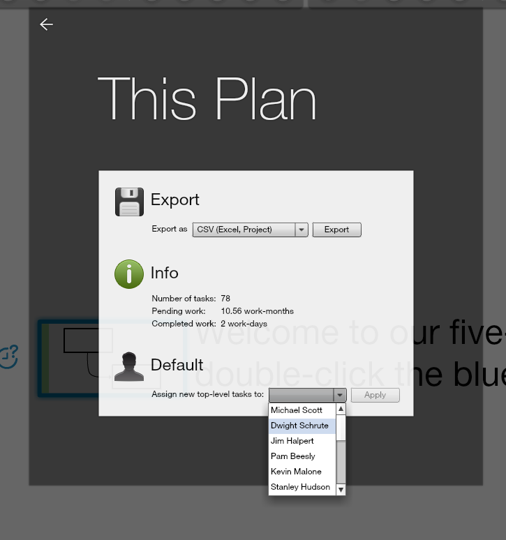
Normally, when you create a new plan, the top task is assigned to you, and so is any additional sub-task you create. You're the default owner, in other words, of any top level sub-task. We've recently added a way to change this. So if you want to assign the top task of the plan to somebody else you can do it by visiting the This Plan dialog inside the menu.
This comes in handy, for example, when the person who created the plan is no longer part of the project.
Our fractal approach to projects, where it's all just tasks containing other tasks, makes Gigantt simpler to learn and more flexible.
" |
Consequently, plans in Gigantt don't really have names. Or, more accurately, the name of the plan is just the name of its top task.
Renaming a plan |
Normally, when you create a new plan, the top task is assigned to you, and so is any additional sub-task you create. You're the default owner, in other words, of any top level sub-task. We've recently added a way to change this. So if you want to assign the top task of the plan to somebody else you can do it by visiting the This Plan dialog inside the menu.
Changing the default owner of top-level tasks |
Our fractal approach to projects, where it's all just tasks containing other tasks, makes Gigantt simpler to learn and more flexible.
Sunday, September 30, 2012
Wiggle
Our latest release of Gigantt introduces a cute little feature called wiggle.
The wiggle button lets you rearrange the tasks you see on screen. Each click on it cycles through a different method of arranging tasks and drawing arrows between them.
See, there's no one perfect way to layout your tasks on screen. Plans are sometimes complex and have odd shapes. Just like no one view is always what you want to see, no particular layout is always the clearest way to visualize your tasks.
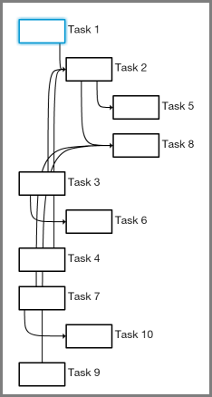
For example, the following plan has 10 tasks with all kinds of connections between them.
As you can see, some of the arrows cross each other in confusing ways and pass "through" tasks on their way. Not so easy to tell what connects to what.
Now let's cycle through some possible wiggles to see alternative ways of laying out the same plan.
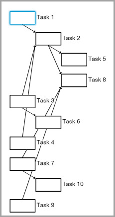
One option is to use straight arrows instead of bendy ones:
That's already an improvement. Making the arrows are less parallel makes them easier to distinguish from one another. Another wiggle option is to leave the arrows the way they were but change the order of tasks on screen:
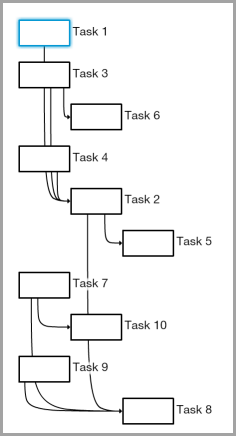
That's a different sort of improvement. The example above uses a different method of ordering tasks called a topological sort (programmers may have observed that the default method is a DFS).
But still some arrows intersect unrelated tasks on their way. Good thing there's another wiggle option that makes sure no two tasks overlap horizontally. Here's what it looks like:
Arrows are easy to follow in the example above, but, of course, this comes at the cost of making it harder to tell which tasks we can start with (i.e. have no prerequisites).
There are more wiggle options than we've shown here. This video cycles through all the currently available options:
Bottom line - you don't always need wiggles, but every now and then they can take a complex-looking plan and make it look simpler. No layout method is perfect since plans come in all shapes and sizes. Some wiggle room is a good idea.
Take a moment to log in to Gigantt and try it out.
Sunday, September 23, 2012
What's On The Menu
We've been listening to your feedback and tallying up the votes. Today we've released a version of Gigantt with quite a few new features. We'll be blogging about each new feature in the weeks to come. Today we just want to draw your attention to one big design change: Gigantt now has a zoom menu system.
Behold!
Here's what it looks like in action:
You can find plenty of new features inside. Go try it out.
Behold!
Here's what it looks like in action:
You can find plenty of new features inside. Go try it out.
Friday, July 13, 2012
Santa Claus, Project Manager
Seasoned project managers know all about the various ways project tasks can depend on each other. Finish-to-start, start-to-start, and so on. But do we really need all these different dependency types? Turns out it really depends on your PM tools. With Gigantt, for example, you don't.
But first let's recap on the different types of dependencies. Wikipedia actually does a pretty good job at it. Here's a shorter version. Also this version uses Santa Claus and is thus inherently better.
This last example (F2S) also introduces a new variable into the mix - the amount of time those tasks must overlap. e.g. we could say that a retiring elf must train his replacement for at least a week.
Aside, then, from the purely logical connection between tasks, we can also talk about how they relate to each other over time. The terms used in such cases are normally lead and lag.
The time between tasks is called a lag. A lead, on the other hand, refers to the period of time when tasks overlap. You can sometimes think of it as a negative lag.
Example: Santa can start inspecting toys after the elves start making them. However, Santa first has to let the elves actually finish making at least a few toys before there are any toys to inspect, right? So we can define a one day lead between the time they start making their toys and the time he starts inspecting them.
Real easy to get a headache from all this stuff... Why can't we just have one simple type of dependency to rule them all?
Then of course you can put tasks inside other tasks, which is basically a S2S or F2F dependency, although an implicit one. If a task contains other tasks then they can only start once their container starts, and their container can only finish once they're finished.
These are simple, intuitive dependencies and we find that they'll do the job most of the time. But every now and then we get questions, usually from experienced project managers, who miss all those other fancy dependencies and their lags and leads and what have you.
Could Gigantt still be useful if it doesn't let you define a negative lag in a finish-to-finish dependency? The answer is almost always "break up your tasks to smaller ones and you won't need anything more". In fact, if you do it this way you'll have a better plan, plus you won't need to bother with complicated dependency types.
Let's see some example.
We asked him to explain why exactly provisioning can start two months before design finishes. He then explained that at a certain point during the design, once "preliminary design" is finished, the team already knows what sort of equipment they're going to need, and so they can provision it. At that point the solution was clear: break the big-old design task into smaller pieces.
Not only is the plan now simpler, it's also safer. Why safer? Because that two-month lag was really just an implicit estimate. What if preliminary design took more than 50% of the total design time? What if it took 75%? A plan that relies on some fixed two-month lag would have been out-dated. But once we break it down to smaller parts we could easily see that provisioning is going to be delayed.
Let's see how some of the Santa examples above work out with simple F2S dependencies.
But first let's recap on the different types of dependencies. Wikipedia actually does a pretty good job at it. Here's a shorter version. Also this version uses Santa Claus and is thus inherently better.
Finish-To-Start
Example: Santa can't deliver toys before his elves make them.Start-To-Start
Example: Santa can't start performing quality inspection on toys before his elves start making them.Finish-To-Finish
Same example: Santa can't finish inspecting toys before his elves finish making them.Start-To-Finish
Example: A senior elf wants to retire, but first he has to spend some time training a new elf in his place. The new elf's training may go on after the senior elf retires, but there has to be some period of overlap.This last example (F2S) also introduces a new variable into the mix - the amount of time those tasks must overlap. e.g. we could say that a retiring elf must train his replacement for at least a week.
Aside, then, from the purely logical connection between tasks, we can also talk about how they relate to each other over time. The terms used in such cases are normally lead and lag.
Lag & Lead
Santa has to rest for a week after delivering toys before he can start working on next year's toys.The time between tasks is called a lag. A lead, on the other hand, refers to the period of time when tasks overlap. You can sometimes think of it as a negative lag.
Example: Santa can start inspecting toys after the elves start making them. However, Santa first has to let the elves actually finish making at least a few toys before there are any toys to inspect, right? So we can define a one day lead between the time they start making their toys and the time he starts inspecting them.
Real easy to get a headache from all this stuff... Why can't we just have one simple type of dependency to rule them all?
The Gigantt Way
When Gigantt draws arrows between tasks it always means one thing - a classic Finish-to-Start connection. Most of the time that's enough.Then of course you can put tasks inside other tasks, which is basically a S2S or F2F dependency, although an implicit one. If a task contains other tasks then they can only start once their container starts, and their container can only finish once they're finished.
These are simple, intuitive dependencies and we find that they'll do the job most of the time. But every now and then we get questions, usually from experienced project managers, who miss all those other fancy dependencies and their lags and leads and what have you.
Could Gigantt still be useful if it doesn't let you define a negative lag in a finish-to-finish dependency? The answer is almost always "break up your tasks to smaller ones and you won't need anything more". In fact, if you do it this way you'll have a better plan, plus you won't need to bother with complicated dependency types.
Let's see some example.
Case study: Negative lag in a Finish-To-Finish Dependency
A user asked us how he could model the following work-plan in Gigantt. His project has a long design stage before development can start. However, two months before the design is finished something else needs to start - provisioning (buying equipment). He wanted something that looks like this:We asked him to explain why exactly provisioning can start two months before design finishes. He then explained that at a certain point during the design, once "preliminary design" is finished, the team already knows what sort of equipment they're going to need, and so they can provision it. At that point the solution was clear: break the big-old design task into smaller pieces.
Not only is the plan now simpler, it's also safer. Why safer? Because that two-month lag was really just an implicit estimate. What if preliminary design took more than 50% of the total design time? What if it took 75%? A plan that relies on some fixed two-month lag would have been out-dated. But once we break it down to smaller parts we could easily see that provisioning is going to be delayed.
Let's see how some of the Santa examples above work out with simple F2S dependencies.
Start-to-Start:
You'll recall that a few toys need to be made before inspection can start. Alright, then let's break it down a bit. We'll split the first batch of toys into its own task and let inspection start after this new task finishes.
Bam! No more S2S with a lead. We can also track how much time the first batch took and use it to adjust our estimates.
Start-to-Finish:
Arguably the weirdest dependency of them all. So let's take the training period example we used earlier. Why should there be a week's overlap? Probably because there's some basic training without which the new elf can't start working, and this is estimated at a week's time. Great, let's model it.
Conclusion
It is our experience that almost all of the time when people say they need various types of dependencies it's for prolonged tasks. Tasks that take weeks or months. Gigantt's power is in enabling you to dive in, break tasks down and uncover hidden work and risks. Once your work chunks are much smaller there really isn't much you cannot model with simple Finish-to-Start dependencies and with tasks containing other tasks.
We're not saying these features are never needed. In some cases they are. But they're always a bit harder to grasp and they complicate your PM tools needlessly. If you can think of real-world examples please share them here. We welcome the discussion. But for the time being we're going to keep Gigantt simple and stick with plain old Finish-to-Start.
Thursday, July 5, 2012
Remember IRC?
Email is evil. This isn't news. It's an information black hole that sucks away at your company's IP. The perfect organization doesn't use email at all. Kind of like the mob.
But seriously, email stinks out loud. So what can we use instead?
I've recently been struggling with this issue. Gigantt uses Google Apps for emails, calendars, some documents, and, well... that's about it. Okay, SSO as well. Google is pretty dominant as a single-sign-on provider. But I digress. I was certain Google had at least some reasonable solution for internal company discussions. Probably just have to search the Google Apps Marketplace and choose one.
Nope.
Turns out the offerings are slim. Why is nobody doing Exchange "public folders" for Google Apps? This is begging to be implemented.
So we gave Yammer a shot. Yammer is nice. Hopefully it'll stay nice even after being acquired. Come to think of it, Microsoft might as well turn that into it's public folders 2.0. But right now it's just not that useful for discussion boards. It's more about being able to like the fact that somebody brought cake to work or released a stable version of something. It certainly has it's place, but it's not where you want to keep your precious, precious corporate discussions.
What about Google Groups? Google Groups just doesn't work well with Google Apps. Don't ask me why. I sure wish it did. But I could not for the life of me create a new Google Group with my Apps account. And besides it's really just a different way of labeling email, when you think about it.
So strike two.
Then I stumbled upon grove.io. They'll host a private IRC server for you. Real easy to get started. In all honesty it's almost just as easy to host your own server on some cloud machine, where you'll have a bit more control over things, but who has time?
So - IRC. Remember? Gosh, it's been years. But apparently some isolated internet tribes have been using this ancient tool all this time. We gave it a try. And you know what, it's pretty f-ing great.
Our organization is distributed. That's another way of saying we're not paying for offices. Or, more accurately, our employees are the ones paying for office space by working from home. The challenge when working from home is to walk the fine line between feeling close to each other, like you could knock on someone's office door and pop-in for a question, and still each having his own space and the ability to get work done. Also, I find it critically important to be able to listen to WHAM occasionally at high volume. Working from home accommodates this need.
But email is horrible and way too offline/async. Chat is evanescent, ephemeral, fleeting and various other synonyms. It's just as bad at sucking away information as email. Once the chatters quit you basically have no idea what the chat they were chatting about. And it's pretty low-tech, too. Chat has like two features - send a message and set your status. That's it.
IRC, on the other hand, is a dream. You've got channels. Channels are by and large public (within the organization). You can search them. You can archive them. Everything is preserved. And you've got commands. Delicious, delicious commands. It's really programmable, configurable, hackable chat. You can make it behave a certain way when you're away, you can tell it which keywords should draw your attention with an audio "bing!" and which can be quietly ignored. You can mash it together with your source control to get commit notifications. Whatever. The point is it's a platform. But above all it just feels cool to be able to hang out in an old-school, ASCII environment.
I realize I sound like a total newb lamer extolling all these virtues that many people have been taking advantage continuously since I last used IRC like 17 years ago, but I can't help it - I'm excited. IRC is just fun. Nostalgia is part of it, I'll admit. But I'm really optimistic about adopting this tool as a core piece of corporate gear. The baseline is a solid, tested, simple way to discuss things in real time. That, by itself, is quite a lot. But on top of it you can tweak and hack the hell out of it with your own bots and your own inner jokes and rules. I really feel I've been missing out for quite a few years.
So go give grove.io a try. You might end up installing your own IRC server, but that first quick taste of that familiar IRC flavor is just a sign-up away, so take a shortcut and try it out (free 30 days trial).
/away playing Song Pop
Thursday, May 31, 2012
Team Invites, Time Estimates and More
We're very excited to share with you three pieces of big news today.
1. Registration is open
If you haven't already you can sign up for Gigantt right now. No more waiting list.
2. Invite people to join you
Starting from today you can freely add team members and resources to your organization.
You can assign tasks to any resource. A resource that's really a coworker can also be invited as a collaborator. This person will then be able to edit your plan alongside you.
3. Flexible time estimates
You're no longer forced to choose an estimate from a fixed set. Now you can just type your own estimate.
Go sign up.
Sunday, April 22, 2012
What's New in Gigantt
We've focused on just one thing in this release - usability. After getting tons of feedback from new users we decided to put new feature development on hold and make the existing ones easier to use.
We've gotten rid of a few buttons that users didn't really need. Now there's tons of space for actually viewing your plan - space that used to be occupied by various panels and toolbars. And of course shiny new buttons for everything.
All New Design
The new look is much cleaner and more compact:
"The Bubble"
Gigantt is all about fast keyboard shortcuts for rapid editing, but over time we've really been neglecting the mouse, and it turned out that quite a few users aren't big fans of keyboard shortcuts. So we've really streamlined the mouse. Now a simple drag operation can both create tasks and draw arrows between them.
Here's how it looks in action:
Mac Support
Gigantt is now officially supported on the Mac and is tested on both Safari and Chrome.
There isn't much difference between the PC and Mac versions, except for the keyboard shortcuts. If you're a mac user you can print out the keyboard cheat sheet.
Tons of Small Improvements
Lots of stuff that you've been asking for and we've finally implemented. Here's a very partial list:
- You can change the estimate of several tasks at once.
- New keyboard shortcuts
- R: Assign to a new resource.
- T: Change the time estimate.
- N: Add a note to the task.
- Double-click outside any task (on the white space) to zoom-out.
- Double-click on an arrow to "split" it (insert an intermediate task).
If you haven't already, go sign up.
Cracking a Safe with UX
Your mission, should you choose to accept it, is to figure out the four-digit code of this safe with just one try:
With only four keys being schmutzed we know whoever punches in the code touches only 2, 5, 8 and probably 9. With four options we have just 256 codes to try.
However, since it's pretty obvious that digits aren't repeated in the code (otherwise we would not see as many as four dirty buttons), the number of combinations drops to just 24.
But can we use our UX expertise to crack this code in less than 24 tries (at most)?
First, the rules should be made clear. In this keypad you have to first press the key button, then the four-digit code, and then the key button again. Now let's have a crack at it.
Which digit is first? That's actually really easy to guess using Fitts' law.
Fitts' law is about ergonomics - how people use machines. Specifically it's about pointing. What it says sounds almost trivial: the bigger and closer the target, the easier it is for us to point to it accurately. So if a button is bigger, it's easier for us to point to it. The same goes if a button is closer to our finger - the farther it is, the less accurate we are at pointing to it.
We can deduce from Fitts' law that the larger the dirt circle around a button, the more the finger had to travel to get to it. The button with the biggest circle of dirt is clearly 2. This means the finger that presses 2 travels the farthest distance from its initial location. Because the distance is so great the finger usually misses it quite a lot, hence the large dirt circle. So its likely that 2 is the first button pressed. The finger has to start from the key button, then travel the greatest distance to 2, and then continue to some other key.
Great.
Code thus far: 2 _ _ _
We're down to 6 possible combinations. But can we narrow it down even more?
Which button is next? If 8 were the second digit, followed by 9 or 5, we would expect to see a bigger dirt circle around 8 than around 5, right? Because the distance from 2 to 8 is greater than from 5 or 9 to 8. Clearly, then, the next key is 5. And now there are just two left.
Code thus far: 2 5 _ _
So which is the 3rd button: 9 or 8? 9 has the smallest dirt circle around it, so it stands to reason that the finger travels a very short distance in order to get to it. This seems to suggest that we need to press 8 and then 9. But if that's the case then why is the circle of dirt around 8 bigger than around 9? Both are pressed after adjacent buttons, after all, so shouldn't we expect them to have the same sized dirt?
Time to think about ergonomics some more. Since the key pad is mounted on a door we need to raise our hand in order to tap on it. Now it's a bit easier to move your finger sideways in this position than up and down. Why? In order to move your finger vertically you have to move your elbow, which requires your shoulder muscles to go to work. Those are some big joints. In contrast, move between horizontally adjacent buttons your elbow can almost stay in place, with only the rest of your arm moving. Try it. I'll wait for you.
See? So vertical moves are harder, and therefor we can expect buttons that are pressed after horizontally adjacent neighbors to have smaller dirt circles than those pressed after vertically adjacent neighbors.
So it's 8 and then 9.
Code: 2 5 8 9
Just one attempt.
Conclusion: Fitts' law works all over the place, not just in computer GUI.
Also: clean your damned keypads.
We used Fitts' law when we designed our new Bubble Menu interface:
The buttons inside the bubble are relatively big and since the bubble opens up wherever you start dragging from the buttons are always close to the mouse's cursor. Close and equidistant.
So go sign up for Gigantt. Active beta users will enjoy a lifetime discount when Gigantt leaves the beta phase.
Sunday, April 8, 2012
Feature Sneak Peak - "The Bubble"
We don't normally do this, but "the bubble" turned out so cool we wanted to share it with everybody even before it reaches production.
Have a look.
Have a look.
Sunday, April 1, 2012
Why geniuses are overrated in software engineering. Knowing that > knowing how.
Knowledge is underrated in software engineering. We value problem solving skills and quick learning a bit too much by comparison. Let me explain what I mean.
Being smart means you can pick up any programming language in no time. You can get to know new technologies quickly and do a good job at using them. But that's not enough. In fact, since learning how to do stuff is so easy these days you don't really get to accumulate a huge advantage over others in this way. Everybody knows how to google, and these days googling takes you 90% of the way to learning anything you need to learn. Sure, smart people learn faster. But how much faster?
Let's see.
One constant (sort of) is the time is takes to read up on something. Even a genius has to actually RTFM, and if the manual has a few hundred pages then it's going to take a bunch of hours to read it. No getting around that. This genius would probably understand it all immediately and realize the implications and possibilities of this new knowledge in a deeper way, while us ordinary folks would struggle a bit. True. Maybe we would need to find a better written text - something that's easier to understand. Maybe we need a few more examples. The bottom line, though, is that it's going to take a non-genius three days instead of one day to reach roughly the same level of knowledge. 3x as fast. That's about it.
Put another way, geniuses are real good at learning how, and that makes them more effective. But the reality of software engineering is that we don't spend the entire day every day learning how to do new things. Most of our time is spent applying this knowledge, you know - actually creating software. So being 3x as fast at learning new stuff probably means you get the job done 15% faster over all. (Why 15%? Whatever, the point is it optimizes a smaller portion of the total work-time as an engineer).
So how come we value IQ so much when we evaluate software engineers? Most of us aren't doing rocket science. There's a minimal brain span you need to have so you don't make stupid mistakes and you can actually understand what you're doing. But beyond that it seems that all this brain isn't really making a difference.
Here's the reason. I think.
What googling doesn't really help you with is knowing that there's something you need to know. It boils down to search being a function that takes a parameter - you search for something. If you have no idea that something even exists then you can't really search for it. To learn that something is possible you need to engage in active exploratory learning. You need to be curious about stuff, talk to people, go outside your narrow field of work and generally fill you brain with facts about the possibility and existence of things.
In short, knowledge, not just know-how, is key. And the kicker is that knowing about something isn't that hard. Don't need to be a genius to remember that you read about somebody who did something. Then you just need to look it up and apply it. This sort of superficial, broad knowledge makes a ton more difference than know-how. Why? Because so much time is wasted trying to solve problems that have already been solved. Being a genius can really be a hindrance to productivity in this sense. Brainiacs often underestimate the difficulty of problems, or just seek out challenges because they're getting bored. This is costly. You don't want a genius reinventing new kind of scalable database for your terabytes of data. You want somebody who's heard of Cassandra or CouchBase and follows the High Scalability Blog. That's the guy you want.
Bottom line, I would value someone who's heard about every new technology or technique much more than someone who would be able to utilize it 15% more efficiently. When the playing field for learning how is pretty much flat, thanks to Google, we can differentiate ourselves and compete by accumulating knowledge. Sounds a bit trivial when put this way, but really this sort of broad knowledge is just not something that hiring managers are focusing on these days. The mantra seems to be that smart people could learn anything, so why bother testing their knowledge - that would be like evaluating a new car model based on where this car has been driven. Kind of pointless, right?
No. It's not like that. It's not just about how fast you can learn - it's more about how much you have learned. It's not just about how deep your knowledge - it's more about how wide it is.
Sunday, March 18, 2012
Speeeeeeed!
Today's release of Gigantt is all about performance. Navigating inside plans, zooming in and out - it's all real snappy now. Try it out: http://www.gigantt.com
So what did we actually do? Programmers, read on. Humans, feel free to skip the rest of this post and move straight on to trying it out.
Our recent releases have been focused on adding functionality and the whole thing just got very heavy and bloated. Memory was leaking because apparently Adobe Flex isn't really meant for creating thousands of recursive controls over and over again. The worst part was the latency - if you've navigated into a task that contained many sub-tasks it would take them a while to load which was very frustrating and it slowed you down. That dog won't hunt. We learned that one of the slowest things you can do in Flex is to add and remove elements from the display list. So now we don't. We recycle and hide unused elements instead of adding/removing them. That also took care of the memory leaks, since apparently we cannot rely on Flex to properly dispose of unused objects (even [sigh] when the Flex Profiler itself shows no paths to those objects from the GC root).
Rendering tiny zoomed-out sub-tasks was rewritten in lower-level Flash graphics (as a C++ developer it sounds odd to me - "low level Flash"... but I'm getting used to it). This approach worked great when we implemented Team View so we adopted in the other views as well.
So how noticeable is the difference? Quite noticeable. We measured how long it takes to drill down from the top of a large plan to the bottom-most "leaf" task and it took about one third of the time. So roughly 3x as fast. But that's mainly because the built-in animation simply takes its time (about 400ms) - without it navigation just seems jumpy and weird. When we profiled just rendering time we saw a 10x improvement.
Hopefully you'll notice this too.
Flash Optimization |
So what did we actually do? Programmers, read on. Humans, feel free to skip the rest of this post and move straight on to trying it out.
Our recent releases have been focused on adding functionality and the whole thing just got very heavy and bloated. Memory was leaking because apparently Adobe Flex isn't really meant for creating thousands of recursive controls over and over again. The worst part was the latency - if you've navigated into a task that contained many sub-tasks it would take them a while to load which was very frustrating and it slowed you down. That dog won't hunt. We learned that one of the slowest things you can do in Flex is to add and remove elements from the display list. So now we don't. We recycle and hide unused elements instead of adding/removing them. That also took care of the memory leaks, since apparently we cannot rely on Flex to properly dispose of unused objects (even [sigh] when the Flex Profiler itself shows no paths to those objects from the GC root).
Rendering tiny zoomed-out sub-tasks was rewritten in lower-level Flash graphics (as a C++ developer it sounds odd to me - "low level Flash"... but I'm getting used to it). This approach worked great when we implemented Team View so we adopted in the other views as well.
So how noticeable is the difference? Quite noticeable. We measured how long it takes to drill down from the top of a large plan to the bottom-most "leaf" task and it took about one third of the time. So roughly 3x as fast. But that's mainly because the built-in animation simply takes its time (about 400ms) - without it navigation just seems jumpy and weird. When we profiled just rendering time we saw a 10x improvement.
Hopefully you'll notice this too.
Subscribe to:
Posts (Atom)