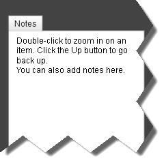
Navigation Panel
I've added a navigation panel to the top of the page. It shows you where you are in the plan and how you got there. It also lets you jump up to "parent" items.
Details Panel
 This is a bit of a break from the initial design that tried to display every related piece of information about an item inline. Inlining is cool, but after trying out a few alternatives I think this is the right direction to go. This clears up the graph area which makes it easier to visualize relationships between items.
In the future this panel will also let you specify resource allocation (i.e. who does what), show conversations people have about the item, history, attachments and more.
Also, there'n an awesome new logo for Gigantt.
Smarter Zoom
Also, there'n an awesome new logo for Gigantt.
Smarter Zoom
The user-interface is now truly infinitely zoomable. This means the UI works just as smoothly and as fast when you have 10,000 items in your work plan as when you have 100. This is achieved by "streaming" the relevant parts of the work plan to the UI for display, instead of displaying the whole thing as one huge scaled interface.
Instead of free-hand zoom this showcase tries a different approach: double-click to zoom into an item and click [Up] to go back. I think it's much more efficient and easier to navigate.
So, what are you waiting for? Go check it out.


